A booking process redesign for The Castle Climbing Centre that significantly reduced the time to make a reservation and increased user satisfaction. 👍
*This was a speculative project and not in association with the Castle.

A booking process redesign for The Castle Climbing Centre that significantly reduced the time to make a reservation and increased user satisfaction. 👍
*This was a speculative project and not in association with the Castle.
The Castle is an indoor climbing centre based in North London. They have been operating from themock-castle building for 25 years.
They operated a walk in service, but have had to move, in full, to a online pre-booking system to comply with government regulations to prevent the spread of Covid-19.
⏱
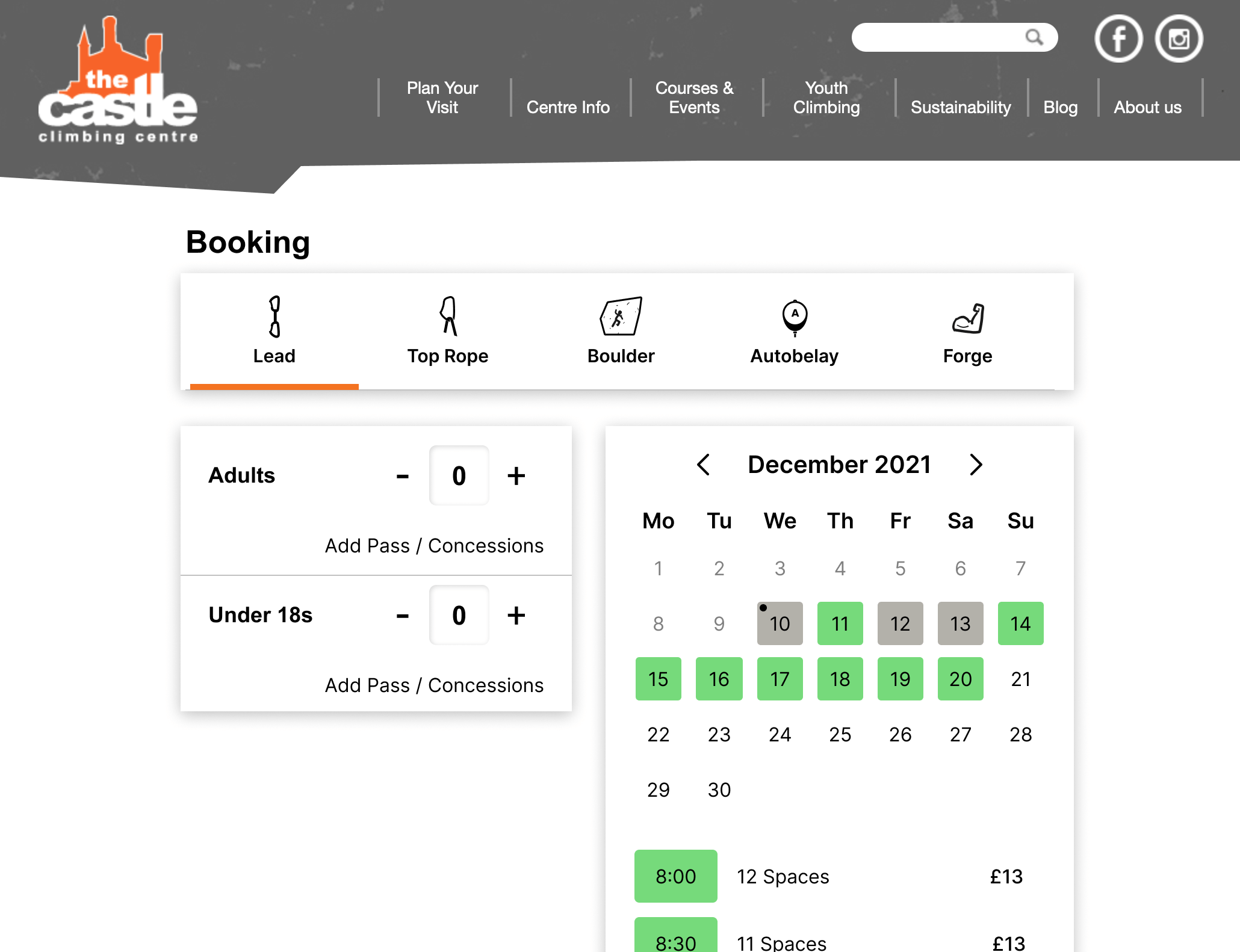
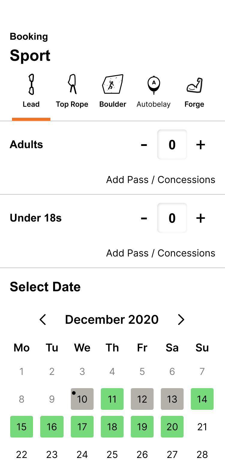
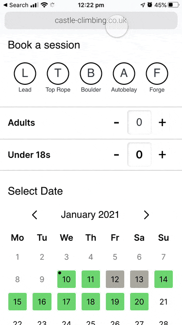
I recruited climbers and tested the existing booking process. I timed each person so I could measure whether my design suggestions were improving things.
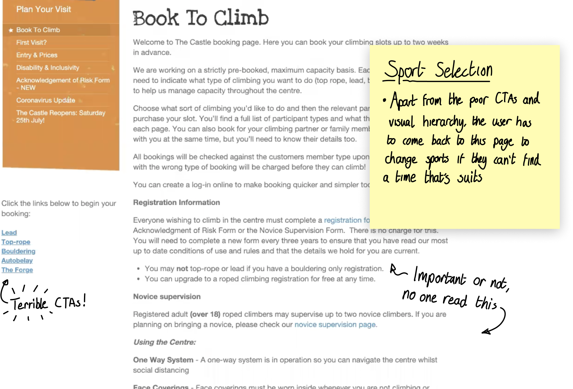
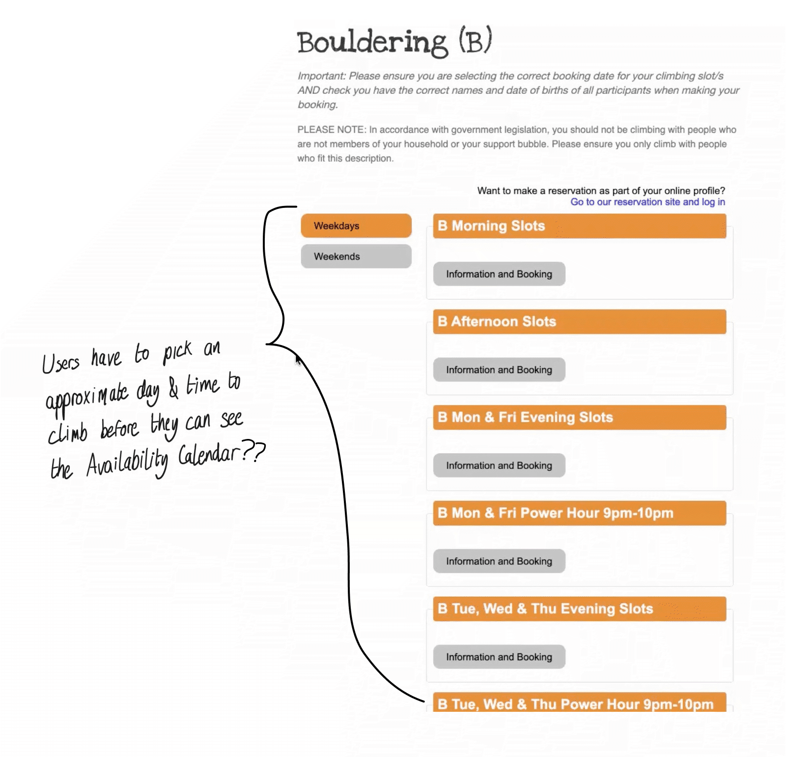

The problems with the existing process were clear from the user testing, and as time was limited, I went straight to prototyping new ideas and testing them with users.
Starting with sketches, I used a UI kit in Figma to produce the interfaces.
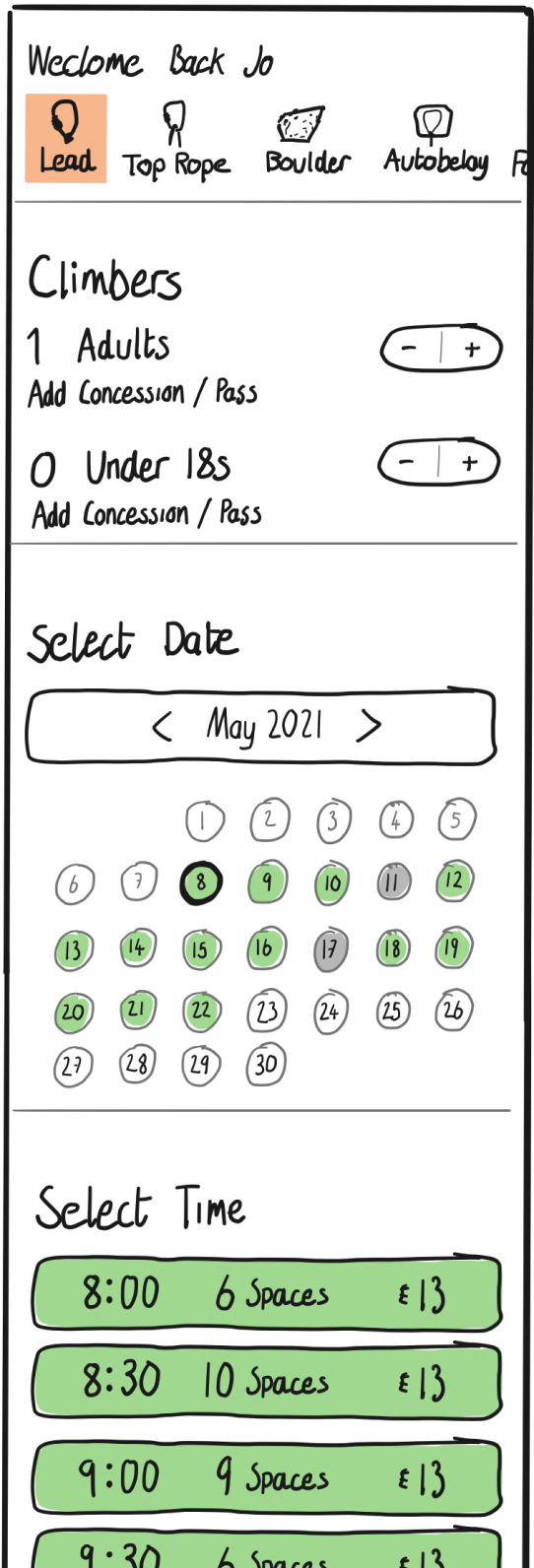
I then used Protopie to build out the interactivity. The first prototype specifically tested the user flow from sport selection to date and time selection, including adding participants.


The results from the first round of user testing were encouraging. Users were completing their tasks in approximately half the time it took them using the existing process. The users were also verbally approving of the changes in the feedback given afterwards.
2x
FASTER
There is a debate in UX community about whether a longer, single page form or a multi-page form is better. I took the decision in this case, that a multi-page form would give a better experience, as the user wouldn’t need to refer to earlier answers (an often cited critisism of multipage forms), and that multipage forms are shown to reduce cognitive load.
Details to collect:
Once the booking was complete, the form offers the user the chance to create an account to save them time on their next booking. This only required a password. I also thought it was best if the browser didn’t redirect them after account creation, so the user can still see all the confirmation details, and other information such as how to get there, and what to bring.
A lot of research went into the form design, including but not limited to these resources on the subject; Venture Harbour
NNGroup
HubSpot

There were three types of concessions or discounts available; student, pre-paid 10 packs & membership passes. It looked like there were two options for prompting the user in the checkout flow:

What are the next steps James?
Integrate the Castle membership system with the booking system.
What benefits are there for the user?
Frequent climbers have prepaid memberships. Because the two systems aren’t connected, these climbers have to queue at the centre when they could be using the express lane.
I can see them appreciating that.
Also, if the user knows their membership id, which is on their key fob, that would be the only piece of personal information required to make the booking.
